Monday, 11 January 2010
Genre
It follows the example of bands such as Metallica and U2 in their locations, with their songs I Disappear and Vertigo, and with the relatively simple, up close and personal camera work which is common throughout the genre.
Helena & Frazer
Narrative
Representation
The one-man band, attempts to fulfill all the roles of the stereotypical band within our music video;
- Using the appropriate instruments, and the typical band layout.
- Giving each member a unique costume, all in the style of "rock stars"
- We related the locations to the lyrics, with the song starting within the desert, and transitioning through the lyrics to Vegas at the end.
- Using Butch's Walkers location in the USA as a basis of our location. With the video based in Arizona.
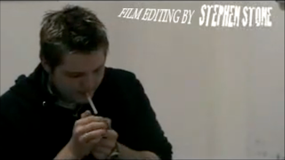
This is a shot from Stuart and Stephen's thriller project. In this shot we wanted to represent the character as a "Bad Boy", and the cigarette is symbolic with criminals in other films.
Audience
Sunday, 13 December 2009
Stephen - Music Video Evaluation
Friday, 11 December 2009
Music Video Evaluation- Helena
Our song comes under the genre of Rock, so a record company producing records for bands similar to ours, would expect the artists to be represented in a ‘rocky’ manner, we achieved this through the costumes our performer was wearing e.g. the head scarf. Many rock music videos have shots of all the band members playing altogether at some point in the video, in the chorus of our project we had all the band members playing and singing together.
The camera shots we used were varied, like in the Rick Astley video there are sections of it which are filmed with the camera hand held, we also achieved this technique, like for example with the outside shots. We also had low angle shots and mid-shots, we used varied shots to keep the audience interested.
Our mise-en-scene consists of instruments and costumes, they are important because the audience has to be able to tell and see the difference between the 4 different characters. During our planning time we watched a couple of music videos to give us ideas on what to include on our product. One of the music videos we watched was ‘The Masterplan’ by Oasis (1995), it consists of 3D animation to give the illusion of a 3D environment, and this gave us the idea to create ourselves some 3D backgrounds. Also we watched ‘I Disappear’ by Metallica (2000), where it has full band member shots; like in our project we did this for the chorus.
For the Digipak we looked various examples, most of which had all of the band members in the front cover e.g. Queen- Greatest Hits. The front cover of our digipak has a picture of all the members with one of our 3D backgrounds. Also we did a parody of the
How effective is the combination of your main product and ancillary texts?
The reason why each panel of our digipak is slightly different is because we wanted to achieve a sense of individuality, but keeping with the four band member concept. One way we combined our ancillary text with our product was by having screen captures from the video on the digipak, so that it links together, also for the magazine advert and the front cover of the digipak we had the four members of the band standing on the 3D Vegas background, we did this because we wanted to maintain the brand identity. For the track list on the digipak we used the night desert picture as the background, we did this because it has a connection with the video, it being a “Summer Desert Night”. The panel with the
What have you learned from your audience feedback?
The feedback from the class on the rough cut said that it was in an unfinished state with the green screen background incomplete; however the class commented that Stuart gave strong performances. The teacher’s feedback on this was that we had unique 3d background ideas, and the idea of having the same person playing as all members of the band worked well. In consequence of the feedback we continued working on the backgrounds, and finalizing the effects e.g. Chroma Key.
How did you use new media technologies in the construction and research, planning and evaluation stages?
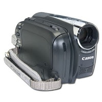
We filmed using a Canon MD205 camera both for our video and documentary, which then was uploaded on the Apple Mac. We used Facebook to talk to each other to plan things for the next lesson, we also used Twitter, Facebook and Myspace to try to contact Butch Walker (The artist of our song) which unfortunately up-to-date we have received no reply. In addition we used YouTube to look at other music video examples to gives ideas on our piece. The programs we used to make the piece were, Photoshop for picture editing (Magazine and Digipak), Final Cut for composing and editing the project and Modo to do the 3d backgrounds.
Frazer Cowell - Evaluation
In our Music Video, we created links between the lyrics and the visuals. An example of this is with the backgrounds we made for use with the Green Screen; the lyric “Summer Desert Night” – And the verse it is in – has a background of a desert at night time.
Record Companies dealing with music form the Rock Genre often want the performers to look the part – look “Rocky”. To fit this, we made the band members wear certain items of clothing. For example, the guitarist wore black gloves and a head scarf.
Rock Videos often show the full band multiple times. In the chorus sections of our song we had all four band members on show. The song is also part of the “Indie” genre; full band shots are often part of music videos for songs in the Indie genre.
In our Digipak we made reference to the famous Abbey Road album cover, by The Beatles. We used this parody for the Back cover of the Digipak.
When filming, because we needed to shoot the same angles and shots for all four band members, we used multiple cameras that were all recording at the same time. This reduced the time needed to shoot as we could get three shots with one take.
Good Mise-En-Scene was necessary to create a clear difference between each of the four band members, since we had the same one performer acting all four roles. Although the use of a microphone and instruments played a big part in showing this difference in character, the use of costume was also important. Because of this, we made all of the band members wear different shirts and jackets. For example, the bassist wore a blue shirt with white text on it whereas the Guitarist wore a cream coloured shirt.
We watched existing music videos to gain inspiration and ideas for our own video. “The Masterplan” by Oasis (Released October 1995) sparked our idea about 3D backgrounds. The song “Vertigo” by U2 (Released 8th November 2004) is in a wide desert setting - we wanted to create a desert scene similar to the one in this U2 video. Sections from the Rick Astley video “Take Me to Your Heart” (Released 1988) uses handheld shots well and gave us the idea to try out these kinds of shots ourselves. The same Rick Astley video also has clips of Astley operating a camera and miming a few lines sang by female backing singers. This gave us the idea of having the same performer for all four band members.
The Album cover to various Wet Wet Wet albums, Queen’s Greatest Hits, as well as numerous other album covers, features all of the band members on the front. With our Album cover we, too, had all of the band members on show. We also parodied the Abbey Road cover, as mentioned earlier.
With our Magazine Advert, we tried to relate it to our digipak design to create brand identity. We did this by using the same image on the Magazine Advert as we did for our Digipak, just with a few alterations – moving the position of the band members is an example of an alteration. We also added the typical details on a Magazine Advert: Album summary, review and the “Out Now” text.
How effective is the combination of your main product and ancillary texts?
When making our Digipak design we wanted it to link in with the video itself. We did this by making sure the four band members, in their costumes, we visible multiple times; Front, Back and on the inside. We also used the 3D backgrounds we made.
Every panel in our Digipak is different to the others because we wanted to create a sense of individuality, but keeping with the four band member concept used in the video.
The front cover itself uses a 3D background used in the video with the four band members, in costume, in the scenery. The Abbey Road parody, used as the back cover of our Digipak, also shows all four band members while paying homage to what can be considered, by many, to be one of the best album covers of all time.
The use of a 3D background on the track list references the “Summer Desert Night” scene from the video.
The panel which consists of the four band members silhouetted was used in our final Digipak design because it is another way to show the difference between the band members without the use of colours.
The two panels behind the two disc spaces are from a screenshot of our final video.
What have you learned from your audience feedback?
Feedback from both our Class and the Teacher about the Roughcut mostly stated that the Green Screen effects needed to be put in place, since our Rough Cut did not include this. Although, we were praised about Stu, our performer, giving a very strong performance.
In response to this feedback we continued to work on the effects, in particular the Green Screening, while also trying to focus on some of Stu’s stronger performances.
The Class Feedback for the final video continues to praise the strong performance from Stu. We have also been told that we have used a good range of camera shots & angles, which help to maintain internet in the video, and that the 3D backgrounds are well made.
Although them being well made, Feedback from our teacher mentioned that the 3D backgrounds may have worked to a greater extent if they had a major dynamic form about them – if they all had little movements and animations to avoid static backgrounds.
How did you use new media technologies in the construction and research, planning and evaluation stages?
We used Facebook for feedback purposes, as well as easy communication between each member of the group. Facebook, Myspace and Twitter were all used to contact Butch Walker. However, we never got any responses, unfortunately.
The website “Youtube” was used by us so we could watch other music videos and to gain inspiration and spark ideas.
We filmed our footage, for both the Music Video and the Documentary Video, using a Canon MD205 camera with this footage then being uploaded to the Apple Mac computer after filming sessions.
For editing, the program Final Cut Express was used, with Photoshop being used for the Digipak and Magazine advert. The Chroma Key effect is the tool used in Final Cut Express to cut out the GreenScreen backdrop.
Thursday, 10 December 2009
Stuart's Evaluation
Our music video and products linked to the music we selected in many ways. Our green screen work was based in the lyrics, with backgrounds coming from mentioned locations. For example, the first line mentions a “Summer Desert Night”, so this was our first background. Our video is also linked to the style of our video. The indie rock style of the song is more suited to a performance video over a concept video.
The green screening in our video limited the lighting we could use. Obviously, our video backgrounds had a particular lighting, and so when filming we had to match the light to the scene, as well as limiting shadows on the green screen.
We attempted to show generalisations of band members with their costume. Our guitarist was given a headband, outlandish hair and gloves to tie in with a glam rock style. Our singer played with his hair, suggesting vanity often linked with a frontman.
Our video links to many other videos of recent years. The idea that we would have all 4 band members as the same person was influenced by Rick Astley’s “Take Me To Your Heart”, in which Astley is shown performing in, filming and directing his own music video.
Our backgrounds were inspired by several different videos. Metallica’s
“I Disappear” shows the band playing in a desert setting, with cutaways linking to the lyrics. “Vertigo”, a U2 video, shows the band in a desert, playing whilst many different visual effects are used around them.
How effective is the combination of your main product and ancilliary texts?
Our digipack was obviously influenced by the famous “Abbey Road EP”, as is shown by the parody of the scene. This album cover is widely regarded as one of the best ever, so our reference to this pays homage to album covers.
Our magazine advert is typical of any album advert for a music video. Standard conventions of a video advert, such as release date, reviews and tracks from the album are included around a central image of the band.
We attempted to make sure our ancillary texts were as similar to the video as possible. Screen caps of the background from the video were used to relate to the video, and photographs of the band had them in the same costumes. The name and the band name sign were taken straight from the video.
What have you learnt from your audience feedback?
Feedback from our teacher led to a re-rendering of our video backgrounds. Steve thought that the backgrounds we had made would be more active, and so re-rendering them moved us from a single frame per verse to several.
Class feedback for the rough cut was of limited use, although this was mostly due to the unfinished nature of the video. As all our footage was not green screened at this point, most of the feed back was on this, although we also received comments on a strong performance and good lip syncing.
How did you use new media technologies in the construction and research, planning and evaluation stages?
Facebook and MySpace helped with the distribution and feedback of our video, as all the people I know can comment. Final Cut’s Chroma Keyer tool was instrumental in our video, and was the most widely used too.
Welcome Post
Sunday, 6 December 2009
Documentary Background
Monday, 30 November 2009
Editing
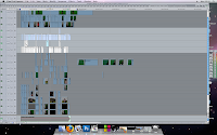
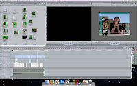 The two images on the left show the program "Final Cut Express" with our video project file open.As you can see, we had many video tracks to edit. This is because of the multiple takes of every "Band Member" we took. Although this meant we had a lot of editing to do, it did give us a lot of flexibility with camera shots.
Finished Digipak Design
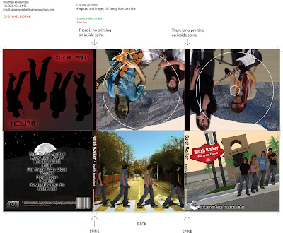
Above is the design for our Digipak. Our front cover shows the title of the Digipak - Butch Walker; Paid to Get Excited - as well as clearly showing our four band members and the record company "Briefcase Records".
Wednesday, 25 November 2009
Digipak Template
 This is the template we gathered from the internet for our Digipak. It contains spaces for six panels.
(In Lesson, write a brief paragraph about where each of the six panels are in "real space")
Tuesday, 24 November 2009
Abbey Road Parody
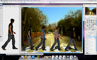
 For our Abbey Road Parody shot, we needed a shot of a Zebra crossing. Our original shot (shown on the left) is of Luard Road in Cambridge. As well as a lack of a Zebra Crossing on the shot the weather was dingy and dull.
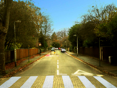 Here is the edited version of the photo. It now contains a Zebra Crossing and we have made the image look much nicer and appealing.
Photo shoot for Digipack and Magazine Advert
Thursday, 19 November 2009
Digipak Research
 This is the opened up digipak for Nuit et Brouillard's album, Flutwacht. This includes the cd of the album, as well as a artworl boklet, complete with lyrics. However, this design is very plain, and we intend to make our digipak more interesting to the eye.
This is the complete digipak from the band Muse. This is their most recent alum, The Resistance. The boxset costs £59.99, And comes with a hard outer case, the original album artwork, a booklet of artwork of the band, the CD, 2 12" vinyls, and a 2GB thumb drive. The pack appears plain at first, but upon opening the artwork is evident and the finished product is impressive.
Initial Ideas for Magazine Advert and Digipack Design
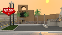
On the right is a pencil sketch of this idea.
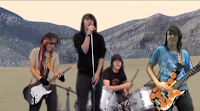 For the inside cover of our Digipack, we intend to use a screenshot from our finish video. The screenshot is the same as the one shown on the left here. We decided on this freezeframe because it contains all four band members during the song's chorus.
The left of this screenshot will contain a track list.
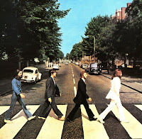 Our idea for the Back Cover was inspired by The Beatles album "Abbey Road". We plan on getting the four band members walking across a zebra crossing in the same way The Beatles have.
Tuesday, 17 November 2009
Feedback for Final Music Video
The feedback we got from the class greatly praised the performance from Stuart, saying the lip-syncing was done well and the act was very believable.
We were told that despite the few technical problems with the Chroma Keying effect in the final video the backgrounds worked well and fitted the lyrics nicely.
TEACHER FEEDBACK
One of the main pieces of feedback that we got from the teacher was about the 3D backgrounds. Although he commented on the advanced look of these backgrounds he said that he imagined them having more animation in them - for example, a car driving past in the Vegas background.
He also commented on the strong performance from Stuart, as well.
Sunday, 15 November 2009
Monday list
This is a list of separate sequences we created inside our Final Cut project, and the editing changes required.
White area again
White area
Tuesday, 10 November 2009
3D Background Test Render
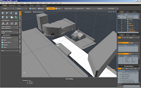
To the left is a screenshot of the program Modo of an in-progress 3D model.
Below is a test render of the "Desert" scene that has been created. It consists of 240 frames and is still in progress - rendered as a test to make sure it would all render correctly.
Monday, 9 November 2009
Tuesday Plan
Checklist for Monday
Wednesday, 4 November 2009
Time Plan for Last Two Weeks
 Across the next two weeks, before the deadline date for the project, we have a lot of opportunity for editing and final filming during our free time. This means that we have a set time to do particular tasks, but we have set aside spare time should the task be a tad more time consuming than first thought.
Today (Wednesday 4th November 2009), we are continuing to edit our footage - Chroma Keying and Cropping, mostly.
We have an hour or so later on in the day, should we need to continue on and finish up this task.
On Thursday 5th November 2009, we will be planning on the weekend filming session of Stu. We will be filming "The Drummer", "The Bass Player" and any last bit of footage required for "The Guitarist".
Saturday 7th November 2009 is the date we will be filming the sections we planned on the Thursday before. Because of the lack of college Over-Weekend Camera Bookings, we will be using Stephen's camera and the GreenScreen sheet we bought.
During Monday's (9th November 2009) our main task will be to get all of our footage uploaded to the computer and commence the editing on this footage.
Tuesday 10th November 2009 will be the continuation of this task. From 4:10pm until 8pm Tuesday we will be staying in college for extra editing time. During this time, the 3D backdrops Stephen has been creating will be finalised.
The last two lessons we have before the deadline, Wednesday 11th/Monday 16th November 2009, we will be completing the editing stage and rendering the final project, in time for the 3:25pm deadline on the Monday.
Monday, 2 November 2009
Class Feedback
However, in it's rough form we appear to have peoples main criticism as being the unfinished state, with the Green screen incomplete and backgrounds missing. As well as a lack of other band members, seeing as we intend to composite the band together from various green screen shots of Stuart as the separate band members, as well as focusing on the ancillary details such as people walking past out of shot which will be cropped out. However they do criticize the close-ups of Stuart and a shot in the college grounds.
Monday, 26 October 2009
Our New GreenScreen
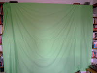
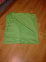 We all chipped in to buy a green piece of fabric which we will use our own green screen instead of borrowing the college's one.
Unfortunately we couldn't get a single piece that would meet our needs. Instead we bought two pieces of fabric, and sewed them together, creating an adequately sized screen.
This fabric, along with the thread used to sew it together, cost just under £15.00 in total - Coming to £3.75 per group member.
Thursday, 22 October 2009
ROUGHCUT MUSIC VIDEO
This is our Roughcut video, uploaded to Vimeo.
It consists of the camera angles we plan on using at the particular moments of the song. However, we have not yet Chroma Keyed out the Green from the Greenscreen and composited the other band members onto the video.
We plan on getting more filming done between now and final editing to ensure we have exactly what footage we would like in our music video.
Wednesday, 21 October 2009
Contacting Butch Walker via Myspace/Twitter 2

As of Wednesday, 21 October 2009, we have no response from Butch Walker on Myspace. However, we now know that he has read the message.
We also have had no response from Butch Walker on Twitter, although he has been tweeting since our message to him so there is every chance that he has read that tweet, also.
Filming
 So far, we have filmed successfully 3 times.
1. Conference room
This was our first greenscreen session that produced useful footage. We used a greenscreen cloth borrowed from another student, and filmed more Singing footage, as well as some of the Guitar footage. Half of one shot was lost, as the tape reached the end. 3 cameras were used, a college camera, Steve's and Helena's cameras, and this session is where the core of our filming took place.
2. Field
This was a in-lesson shoot, on the college playing field. We did this as we were asked if we had any other shots in our video other than greenscreen. Two shots were taken, A handheld shot folling the singer, and another handheld shot, held by Stu while he was singing. These shots are unsteady, and so it is likely little of these shots will be used.
3. Music Room
This was our most recent shoot, and focused on the drums. Still greenscreened, most of this shoot was used to film cutaways of the drums, as we were limited by music lessons in other rooms.
Also, we have attempted to film 2 unsuccessfully.
1. Outside
This shoot, although giving us footage, was unsuccessful as although it was goodfootage, it was difficult to cut out and chromakey as wind meant ripples in the greenscreen. This was our first shoot.
2. Tuesday
We attempted to shoot on tuesday, but we were limited as the conference room was unavailable and the greenscreen was in use.
Monday, 19 October 2009
Panorama Permission - incomplete
 Due to the nature of the background and wanted flexiblity, I decided to use a Panorama as a base for this as I could technically have the entire background with 360 degree visibility easily, if the lighting is correct, without having to change anything.
 However I did not have a desert to take my own a Panorama with, therefore I searched for one using Google. I found a suitable Panorama on TwoPennies blog, made by a few posters who had made a trip to the Red Rock national park previously and had
stitched together the photo of the park in a 360 degree panorama which was perfect for my uses.
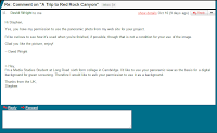
I contacted him via his blog and he replied both in the comments section and via my email address.
3D background start - proof of concept
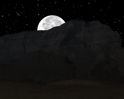 The song references "on a summer desert night", this is literally a work in progress desert scene to create a viable background for our music video, created with Modo using textures projected from a panorama which I found, and gained permission to use. The mountains are literally those on the left of the panorama.
This was rendered far too dark, with no real lights but using just the moon image and a starfield. Which meant I just increased the brightness in Photoshop for this picture to make it far brighter however in the future I can easily increase the brightness by simply changing the gamma value.
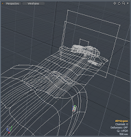 This is the current Wireframe, the sand, the original grassy heath which I will recreate at a later date and than the mountains in the background.
The moon and visible stars are both billboards placed behind the mountains as you can see by the two squares behind the mountain. There is a 3rd starfield in a sphere encircling the entire scene however it deforms the image and therfore visibly I replaced it. It however does light the scene. The moons and stars are currently the only light sources in this scene which drives up render times.
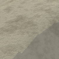
I will make heavy use of procedural textures as, my first attempt at sand is visible on the left, it is literally two bump layers (an illusion of depth) layed on top of each other to show both the graininess of sand and also the random variation of the surface of the sand.
Therefore the first layer to allow graininess is at a far higher resolution and set to add over the second layer which gives the sand shape.
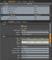 It also has a base colour which has another layer of noise to multiply onto it to give it some variation.
It consists of no image map but is purely computer generated. I will use this technique where possible to limit the amount I need to gather.
Thursday, 15 October 2009
Green Screen Testing and Set Up
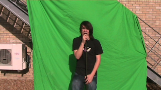 Originally, we tried having the green screen sheet secured outside. We found this problematic for a few reasons.
The first of these problems being lighting issues, mainly the weather/position of the sun. To get good light on Stu, this meant that a shadow was cast on the greenscreen which meant the Chroma Key made it difficult to cut out.
The other problem was the wind. This meant the Green Screen was being blown a little and therefore the creases were obvious and hard to Chroma Key out.
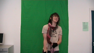 Our second setup was inside (Using a different Green Screen Sheet). We found this to be a much better set up due to the matte lighting and on casting shadow.
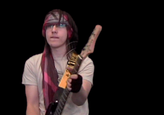 After Chroma Keying out the Green we found that the inside set up worked much better.
Tuesday, 6 October 2009
Visit from Ed Lovelace on 7th October 2009
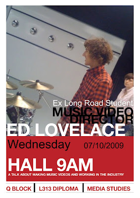
Former Long Road Media student Ed Lovelace gave a talk to the media students on Wednesday the 7th of October, he talked about his music videos and career path into the film industry.
After Long Road he went to study Video Production at Bournemouth University (2003-2005). After he finished his university degree he went to work for a production company in London named Pulse.
Now he has a production company called Daryl.
With the company Pulse, Ed Lovelace has produced a numerous amount of videos, including the ones below
'Ain't No Rest For The Wicked' - Cage The Elephant
'In One Ear' - Cage The Elephant
Both Cage The Elephant videos were filmed on a £40,000 budget.
'Abandon Ship' - Gallows
'Laser Hannon' - Cutting Pink With Knives
This video was filmed in just 2 hours! In someone's friend's basement, it was made to look like it was filmed all in one shot, however it was a "faked" one shot - with the use of pillars and walls as places for the shot changes to take place.
Monday, 5 October 2009
Contacting Butch Walker via Myspace
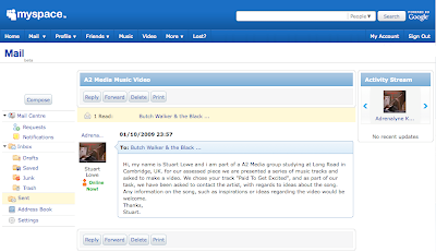 This is a screenshot of our message to Butch Walker through Myspace. The message is as follows;
Saturday, 3 October 2009
Contacting Butch Walker Via Facebook
 Along with our attempts to contact the artist of our song choice through Twitter, we have posted a comment on Butch Walker's Facebook page.
"Hello there! I'm a student at Long Road 6th Form College in Cambridge, and for our Media coursework we have to make a music video, and we picked one of your songs "Paid To Get Excited" and we would like to ask if you've got any tips or anything for us. I hope to hear from you soon. thanks :)"
Thursday, 1 October 2009
Frazer's Favourite Music Video
Steve's Favourite Music Video
Stuart's Favourite Music Video
Contacting Butch Walker Via Twitter
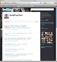 With the use of the Twitter website, we have contacted the artist Butch Walker. His Twitter username is ButchWalker.
Due to Twitter limits (140 Characters per "Tweet" , including the "@Username" tag) we had to keep our tweets short while still asking what we wanted to ask him. We ended up having to Tweet twice to fit in what we wanted to say.
This is what we tweeted to Butch Walker:
FrazerJC @butchwalker My A2 group at Long Road 6th Form College have chosen your track Paid To Get Excited for our assessed
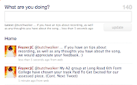 piece. (Cont. Next Tweet)
FrazerJC @butchwalker ... If you have an tips about recording, as well as any thoughts you have about the song, we would appreciate your feedback. :)
This is also shown in the screenshot to the left of this post.
Song Lyrics - Paid to Get Excited
While kids in school are forced to sing the battle hymns just right,
Extras paid to get excited on the tv screen,
So doped up on diversions that they dont know what it means
To be free to hate the ones you hate,
Free to love the ones you love,
Free to like the land you live on,
Not the one who leads,
All I’m sayin’, dig the grave you lay in,
After all, you make the call,
Hang up before its too late
Make sure to give your full attention smile the best you can,
Watch this hand give peace sign while the other chokes a man,
Cuz he wants to love another man they’ll tell you that its bad,
Some book that set the moral codes is glamourized in ads
So be free to hate the ones you hate,
Free to love the ones you love,
Free to like the land you live on,
Not the one who leads,
All I’m sayin’, dig the grave you lay in,
After all, you make the call,
Hang up before its too late
And the backflipping, spike-haired preachers preaching through their headset mics
Saying god is the new elvis and he’s “gonna rock tonight”
So just sip on that new energy drink although it tastes like shit
Cuz a pretty t.v. couple says they cant live without it
Free to hate the ones you hate,
Free to love the ones you love,
Free to like the land you live on,
Not the one who leads,
All i’m sayin’, dig the grave you lay in,
After all, you make the call,
Hang up before its too late
Free to hate the ones you hate,
Free to love the ones you love,
Free to like the land you live on,
Not the one who leads,
All i’m sayin’, dig the grave you lay in,
After all, you make the call,
Hang up before its too late
Ooooooooh
Wednesday, 30 September 2009
Postcard
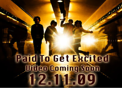 This is our postcard advertisement for our music video of the song "Paid To Get Excited".
We chose this image because we like the lighting effects, the colouring, the idea of people (possibly band members) jumping in front of a beam of light.
The outer glow effect on the text creates more focus towards the text itself meaning that the audience's eyes aren't just drawn to the background image, but also to the song title, and the video's release date.
Music video plan and Ideas
 We intend to open with only the dark silhouette of Stuart visible, with him visible but dark, as the first verse starts, he is lit by "floodlights" and the song lyrics start from there. We intend to have Stuart performing on the greenscreen, allowing us to add him into an artificial environment created by Stephen, in full 3D. As the first verse progresses, the sky lightens and as the chorus starts, the sun rises and by the end of the chorus the sun has risen and we switch to the second scene for the next part of the video. The first scene is a desert scene due to the lyrics and shows Stuart performing in all 4 roles after.
During the video we intend to create a full day cycle. With the song progressing through and following the lyrics with Stuart superimposed. However the issues with this will be creating the lighting for Stuart to be convincingly performing in the environment, meaning they must be done before we commence filming.


